Simplifying the IMDb Homepage
A UI Redesign to Improve Structure and Clarity
Key Skills Demonstrated: UI/UX Design, Visual Design, Information Architecture, Competitive Analysis, Figma Prototyping
Executive Summary
I redesigned IMDb’s homepage to improve usability, readability, and content structure. The original homepage was cluttered, with redundant sections and an unclear hierarchy, making navigation overwhelming.
Using heuristic evaluation, common UI patterns, and competitive analysis, I streamlined the layout by removing unnecessary sections, standardizing UI elements, and improving navigation accessibility. The redesign resulted in a cleaner, more structured interface that enhances user experience and decision-making.
1. Setting the Scene
As a frequent IMDb user, I found the homepage overwhelming; cluttered with redundant sections, unclear categorization, and content that felt irrelevant. It seemed optimized for SEO rather than user experience. For my Visual Design class at the Interaction Design Foundation, I set out to improve its usability.
Key issues with the existing homepage:
Cluttered Layout – Too many stacked sections made navigation overwhelming.
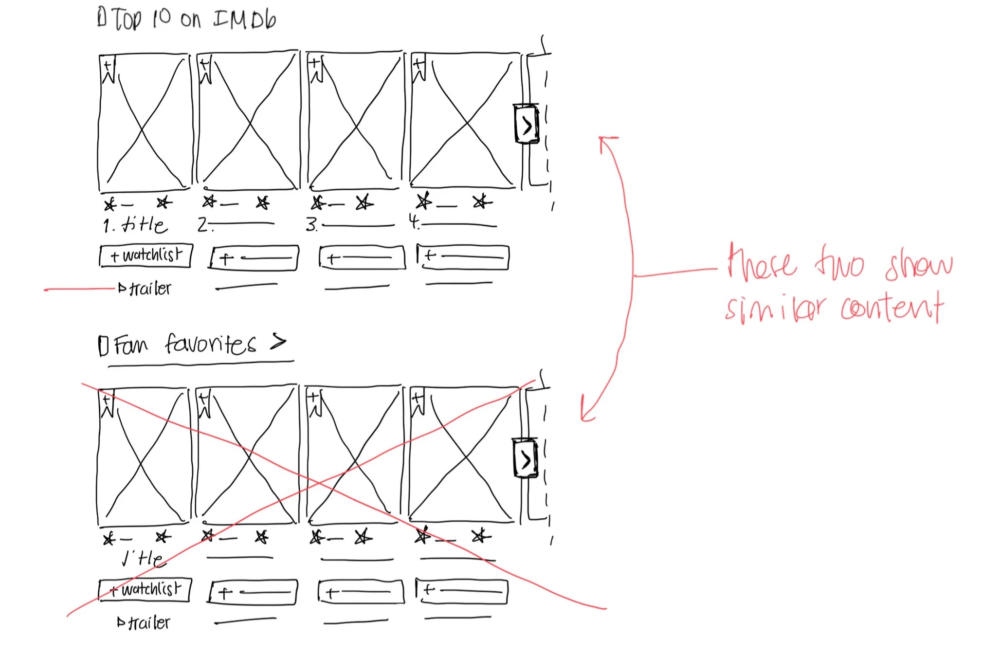
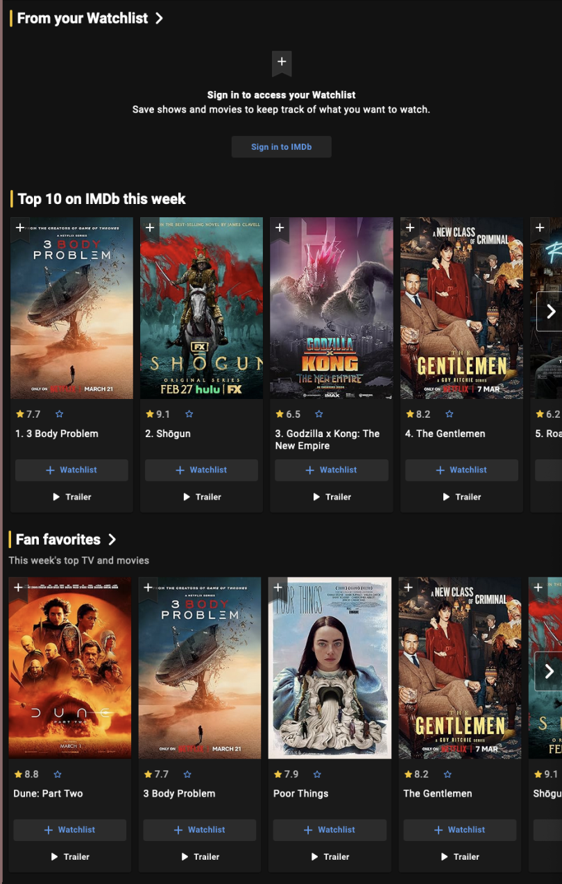
Redundant Categories – “Top 10,” “Fan Favorites,” and “Top Box Office” featured similar content.
Poor Information Hierarchy – Some sections were unclear in terms of what content the user would see (e.g., articles vs. trailers).
Irrelevant Content – “Born Today” felt misplaced, more suited for search or menu than the homepage.
Lacking direct user interviews, I used heuristic evaluation, common UI patterns, and competitive analysis to guide my redesign.
Annotated Hero Section of Home Page
Annotated Carousels of Home Page
3. Design Goals & Approach
I analyzed Rotten Tomatoes and Netflix to understand how they structured content and presented categories effectively.
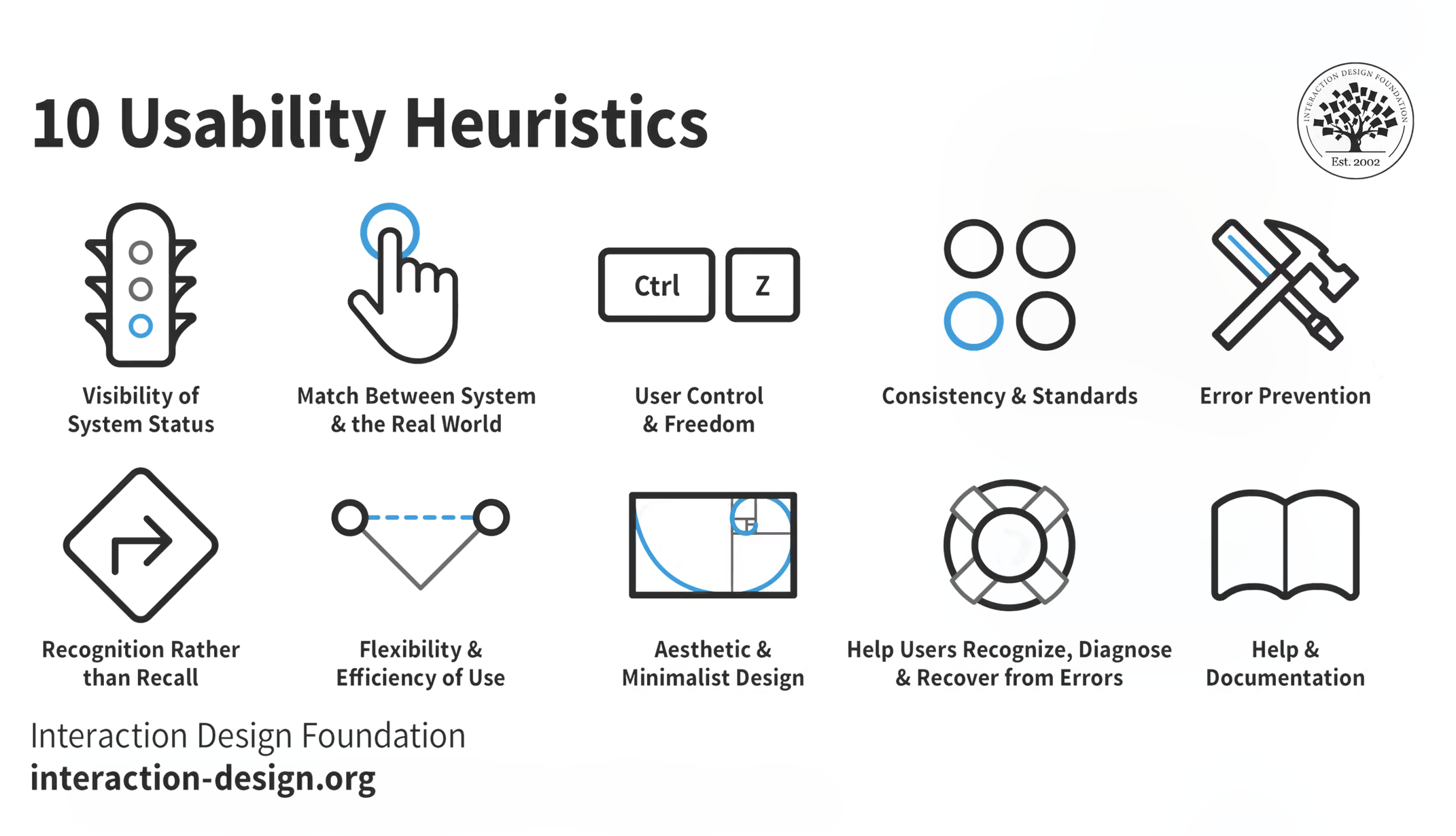
The design was also focused on common UI patterns and the 10 Usability Heuristics by Jakob Nielsen.
So the focus on this redesign was on:
Reduce cognitive load
Remove unnecessary sections and simplify the hierarchy.
Improve layout consistency
Standardize UI elements like buttons and cards.
Refine content structure
Prioritize useful information.
4. The Design Process
Sketching & Wireframing
Sketched the existing IMDb homepage, annotating pain points.
Created a revised wireframe, simplifying the layout while keeping IMDb’s design language.
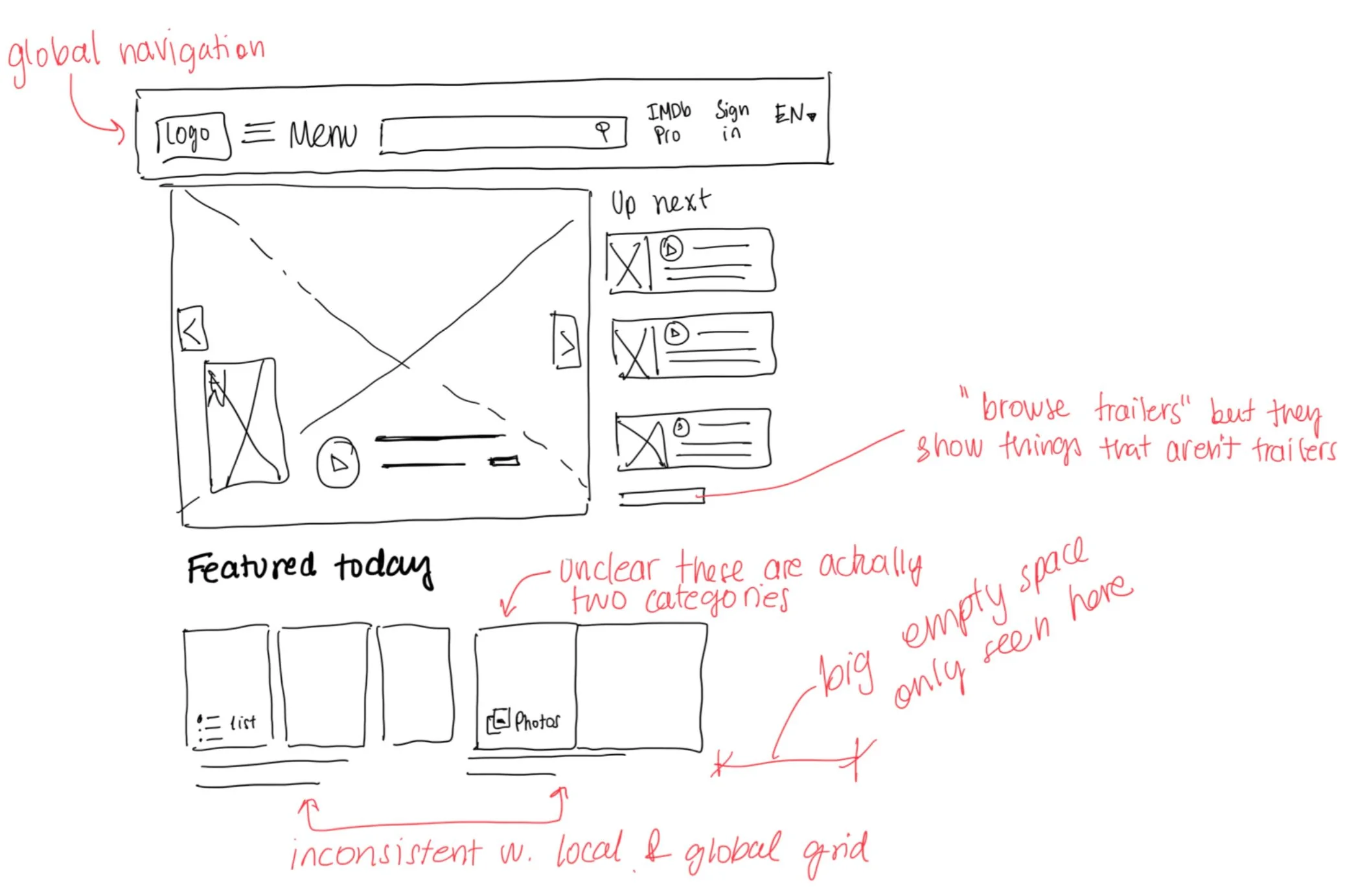
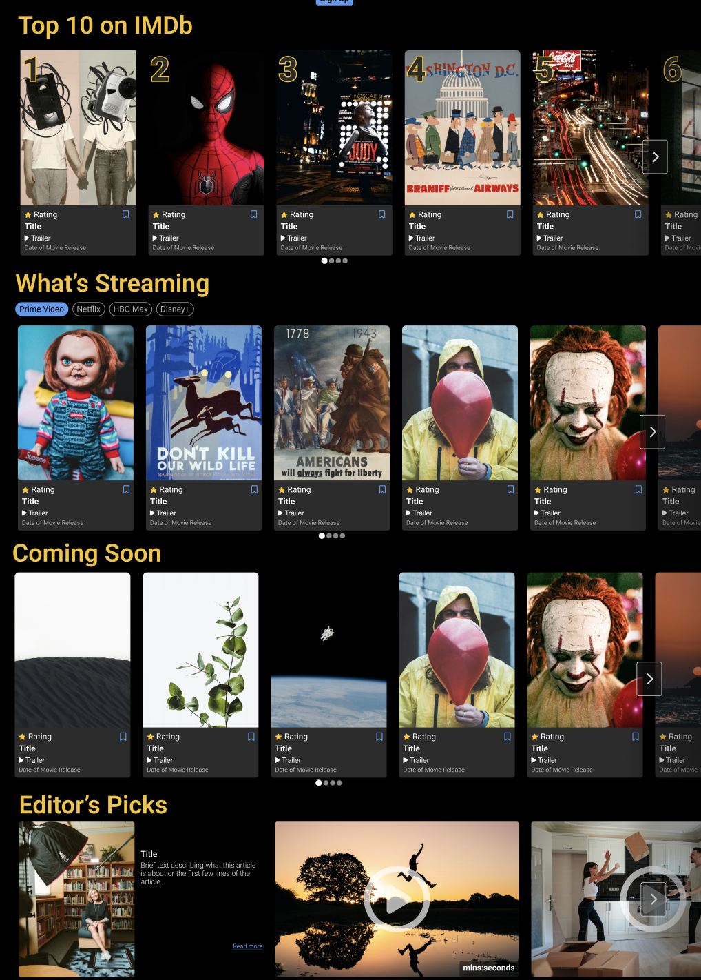
Let’s look at the hero section of the home page for comparison:
This is a sketch of the existing hero section of the IMDb page. It had mixed content so the carousel not only shows trailers, interviews, and written articles. Similarly, the featured today has mixed content and a layout that is not consistent with the global grid.
I changed the hero section to a center stage layout using a simplified carousel with thumbnails. This section now only shows trailers. I included primary and secondary buttons for movie relevant information. Right below is the option to sign in and get custom recommendations.
Building the Prototype
I built a high-fidelity, animated prototype in Figma, focusing on consistent UI elements, hierarchy, and navigation.
Key UI Changes
Simplified homepage length – Removed repetitive content such as “Fan Favorites” which was too similar to “Top 10 on IMDb”.
Standardized cards – Unified layout for better readability.
Refined content placement – Removed content better suited in the menu, search, or user profile such as “Born Today”, “Top Box Office (US)”, and “From Your Watchlist”.
Usability and navigation – Changed the global menu to a drop down menu, as the original website uses a hamburger icon, which is often deemed bad for usability and finding content quickly.
Adding filter options for “Whats Streaming” section – This is both a business (as IMDb is owned by Amazon) and UX change. Adding platform streaming filters would make this feature a lot more valuable to users as content is split between various platforms and varies per location. Giving users this tool would also make their “watchlist” more useful.
Consistent UI elements
Standardized button styles and card layouts, helping to reduce cognitive load on users. Content is clearly labeled and different media is presented in a different manner.

Improved visual hierarchy
Sections are clearly separated and have a large heading that labels the content. Sections are consistent and include dot pagination so users can focus on the content and not get lost. Additionally, ranking sections such as “Top 10 on IMDb” have a big number to cue the user that this is a ranked list.
Finally, a few sections were cut out as they might be better placed in the menu, user profile, or search functions (e.g. Born Today, Top Box Office (US), and From Your Watchlist).
Before
After
Streamlined navigation
Replaced the hamburger menu with a semi-hidden menu. Since there are many options, I listed the main categories in the menu that can be opened up with an overlay. This was done for accessibility and usability as research indicates that a less visible menu is less used and more confusing to users.
See research: Hamburger Menus and Hidden Navigation Hurt UX Metrics by NNGroup
Before

After

Prototype Demo
5. Evaluation
Expected Benefits
Cleaner, structured layout – Less visual clutter.
Faster decision-making – Improved content prioritization.
Higher account conversion – Creating an account is easier to access and labeled with clearer benefits.
Better accessibility – Clearer labeling and navigation.
6. Key Takeaways & Next Steps
Lessons Learned
UI consistency improves readability – Standardized cards enhanced usability.
Less is more – Removing redundant content streamlined navigation.
Accessibility matters – A simple menu redesign improved clarity.
Future Improvements
I worked on this project a while back and since then the website has changed, for example with the inclusion of “Coming Soon” content. I would further refine the relevant content on the homepage with:
User Testing: Validate design decisions with usability testing.
Card Sorting: Ensure homepage categories as well as the global menu align with user needs.
More personalization: Users could have curated lists, preferred platforms, or follow other users to create a more engaging community. More user research and an analysis of websites such as Letterboxd could provide interesting insights.