" height="69.489708697824px" id="hAb39VNj1" transform="translate(74.731 0)" width="75.26858520324419px"/><path d="M 111.162 68.12 C 109.814 68.431 107.503 68.948 107.315 69.108 C 107.036 69.345 105.166 81.363 105 82.433 C 102.676 97.369 103.079 106.241 102.55 109.8 C 102.38 110.939 73.62 110.393 74.049 109.161 C 82.625 84.526 90.715 71.212 90.785 71.033 C 92.438 66.785 94.01 61.882 94.809 61.111 C 95.072 60.858 97.828 58.2 98.107 57.952 C 105.929 50.993 115.192 53.184 122.575 54.546 C 125.805 55.142 132.367 57.063 141.184 53.365 C 142.022 53.014 142.035 52.798 145.597 53.149 C 147.977 53.383 148.945 53.441 149.238 53.467 C 149.97 53.533 149.207 54.062 149.166 54.091 C 147.025 55.576 141.087 60.652 140.239 60.862 C 125.693 64.468 125.692 64.403 111.162 68.12 Z M 67.818 19.238 C 69.629 24.816 68.195 26.004 70.451 27.46 C 76.116 31.117 79.911 32.389 80.321 32.854 C 82.757 35.616 80.963 38.116 80.5 39.072 C 80.133 39.832 80.521 39.825 81.293 40.159 C 83.977 41.321 82.992 43.467 83.354 44.509 C 83.729 45.589 85.408 44.751 85.485 48.032 C 85.626 54.014 87.615 55.173 87.414 57.2 C 87.37 57.652 86.14 59.755 86.061 59.86 C 81.448 65.954 76.485 66.897 74.47 70.101 C 73.943 70.94 70.923 75.741 71.131 82.037 C 71.138 82.259 72.19 86.569 74.045 92.13 C 75.739 97.21 76.257 98.54 76.403 98.807 L 72.181 109.147 C 72.181 109.147 63.572 110.429 54.584 110.422 C 44.807 110.414 34.582 109.115 34.501 109.081 C 34.029 108.879 37.83 99.09 37.238 94.193 C 36.207 85.647 36.747 82.968 31.814 79.874 C 29.842 78.637 29.805 78.728 27.804 77.519 C 23.339 74.82 18.632 70.413 18.632 70.413 C 18.632 70.413 17.085 73.367 12.692 73.401 C 9.249 73.428 8.071 70.803 7.745 67.847 C 7.496 65.585 9.553 64.348 9.553 64.348 C 9.553 64.348 9.27 67.443 10.053 67.934 C 11.347 68.746 12.618 67.038 12.728 66.76 C 13.414 65.028 12.158 61.964 12.035 61.634 C 11.115 59.187 8.629 54.507 8.629 54.507 C 8.629 54.507 8.59 54.54 8.459 54.62 C 7.597 55.148 5.48 55.123 2.605 53.058 C 1.788 52.471 0.96 51.655 0.405 50.156 C 0.08 49.278 -0.531 46.127 0.95 45.068 C 4.011 42.88 5.754 47.56 4.961 48.409 C 4.897 48.478 4.628 47.265 3.046 47.403 C 1.162 47.567 2.931 51.322 5.437 50.484 C 6.134 50.251 7.071 48.831 7.197 48.444 C 9.061 42.684 3.884 28.993 3.926 25.686 C 3.955 23.323 6.402 21.893 7.503 21.752 C 8.31 21.649 9.61 22.956 9.68 23.079 C 11.46 26.194 8.306 27.272 7.618 26.244 C 7.243 25.682 7.575 24.669 7.587 24.541 C 7.6 24.398 7.343 23.966 7.052 24.523 C 6.8 25.006 6.374 25.047 7.208 27.928 C 7.813 30.018 9.514 28.847 10.025 27.71 C 11.938 23.451 12.464 21.189 12.883 19.75 C 14.541 14.048 13.8 10.147 15.664 7.127 C 16.036 6.524 16.832 5.982 17.798 5.869 C 21.593 5.426 20.826 9.913 20.654 10.268 C 20.605 10.368 20.22 7.852 18.199 8.69 C 16.174 9.531 17.239 11.685 17.577 12.092 C 18.499 13.199 19.28 13.68 22.137 13.109 C 27.938 11.951 28.005 4.989 35.372 0.681 C 36.315 0.13 37.67 -0.249 38.642 0.195 C 41.7 1.594 38.65 5.998 37.667 5.569 C 36.553 5.083 37.258 3.087 36.22 3.341 C 34.344 3.799 34.888 5.556 35.405 6.14 C 37.248 8.222 39.793 6.645 42.381 4.835 C 45.296 2.795 47.077 2.123 47.16 2.078 C 51.205 -0.103 59.269 -0.356 66.205 1.852 C 68.339 2.532 70.533 3.442 72.068 6.024 C 73.032 7.646 72.129 11.207 71.154 12.036 C 70.118 12.919 67.374 12.615 66.116 11.223 C 66.044 11.058 70.583 10.302 66.913 7.309 C 65.082 5.815 62.262 8.028 62.262 8.028 C 62.262 8.028 63.502 11.061 63.714 11.336 C 66.236 14.603 67.298 17.641 67.817 19.239 Z M 76.44 98.718 C 76.44 98.718 76.497 98.977 76.403 98.807 Z M 65.576 28.196 C 65.499 28.086 63.366 27.24 63.366 27.24 C 63.366 27.24 63.701 25.719 63.841 24.655 L 57.538 30.663 Z" fill="rgb(255, 240, 230)" height="110.42344423666296px" id="mlg4x5QBc" transform="translate(0 16.879)" width="149.55422871054597px"/></g></svg>)
Designing a format-flexible book subscription experience
Bringing physical, ebook, and audiobook readers into a more inclusive membership model.
Wonder Books is a conceptual subscription platform designed to extend curated book experiences beyond traditional physical boxes, by also supporting readers who prefer ebooks or audiobooks.
Why it matters
Most book subscription services are built around physical book boxes, with format assumptions embedded into pricing, logistics, and community access.
What was happening
Readers who preferred ebooks or audiobooks had limited flexibility, often paying for physical shipments to access curated selections or book club participation.
How I addressed it
Designed a subscription system where format is a selectable layer, allowing members to choose physical, digital, or hybrid plans without fragmenting the curated experience
Role
I led the end-to-end product concept, defining the subscription structure, configuration flow, and visual system.
Design Focus
The primary focus was designing a scalable subscription architecture that supports multiple formats without increasing configuration complexity. The goal was to balance flexibility with clarity.
Process
1. Understand
Reviewed existing book subscriptions, reading platforms, and accessibility guidelines to understand current limitations around format flexibility and personalization.
2. Explore
Explored different ways to structure subscription choice and configuration, focusing on how decision hierarchy affects clarity and cognitive load. This phase focuses on how early concepts evolved as complexity increased.
Exploration Outcomes
Identified where users hesitated most during configuration
Simplified decision steps without removing control
Chose progressive disclosure over comparison tables
3. Design
Designed a guided subscription experience and visual system that translate exploration insights into clear, approachable UI patterns.
4. Iterate
Refined flows, hierarchy, and interactions based on feedback and accessibility considerations.
5. Deliver
Produced a functional prototype demonstrating onboarding, subscription selection, and configuration.
Final Design
The final design translates the exploration into a guided subscription experience that balances flexibility with clarity. It focuses on helping users choose a reading journey first, then progressively configure their subscription without feeling overwhelmed.
Guided Subscription Flow
The subscription experience introduces a wizard-style flow that helps users select their reading journey before configuring details. Anchors on the page allow users to navigate between genre-based and custom options without losing context. From here users can choose between: 1. A customized subscription 2. A genre based subscription.
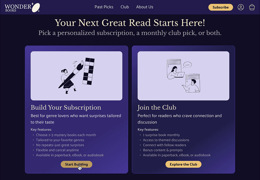
Choosing a reading journey early helps users understand what kind of decision they are making before configuring details.
Subscription Cards & Configuration
Each subscription card contains its own configuration options, allowing users to choose format and payment frequency through progressive disclosure. This keeps complexity localized and prevents conflicting global states. Configuration options are revealed progressively within each subscription card, allowing users to adjust format and payment frequency without leaving the page.
Custom Subscription
Users can customize all aspects of the subscription from how many genres they want, to format and billing cycle.
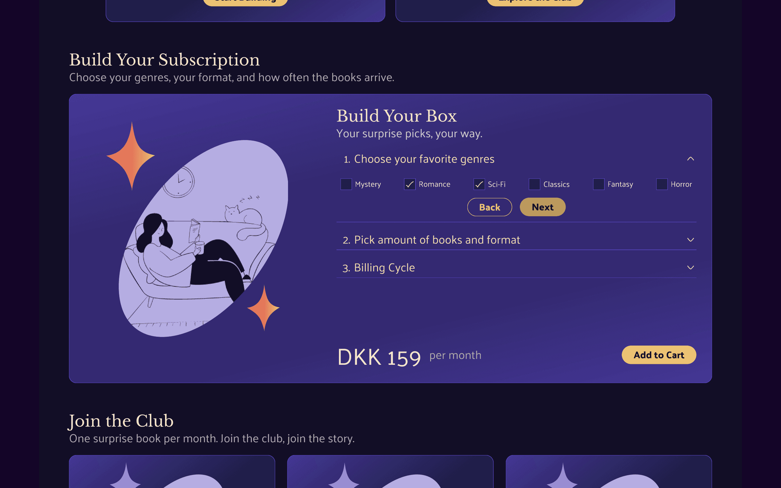
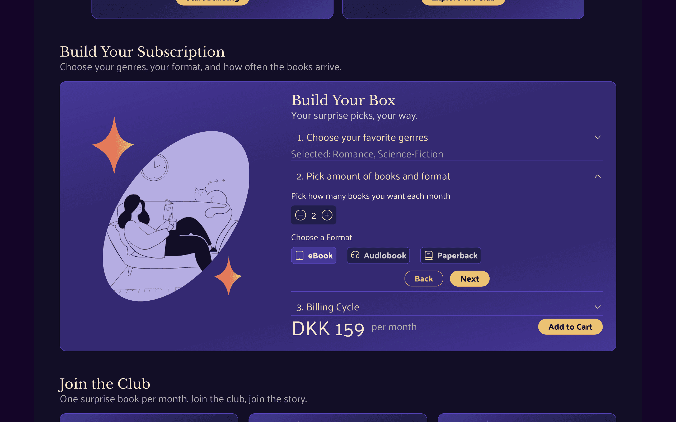
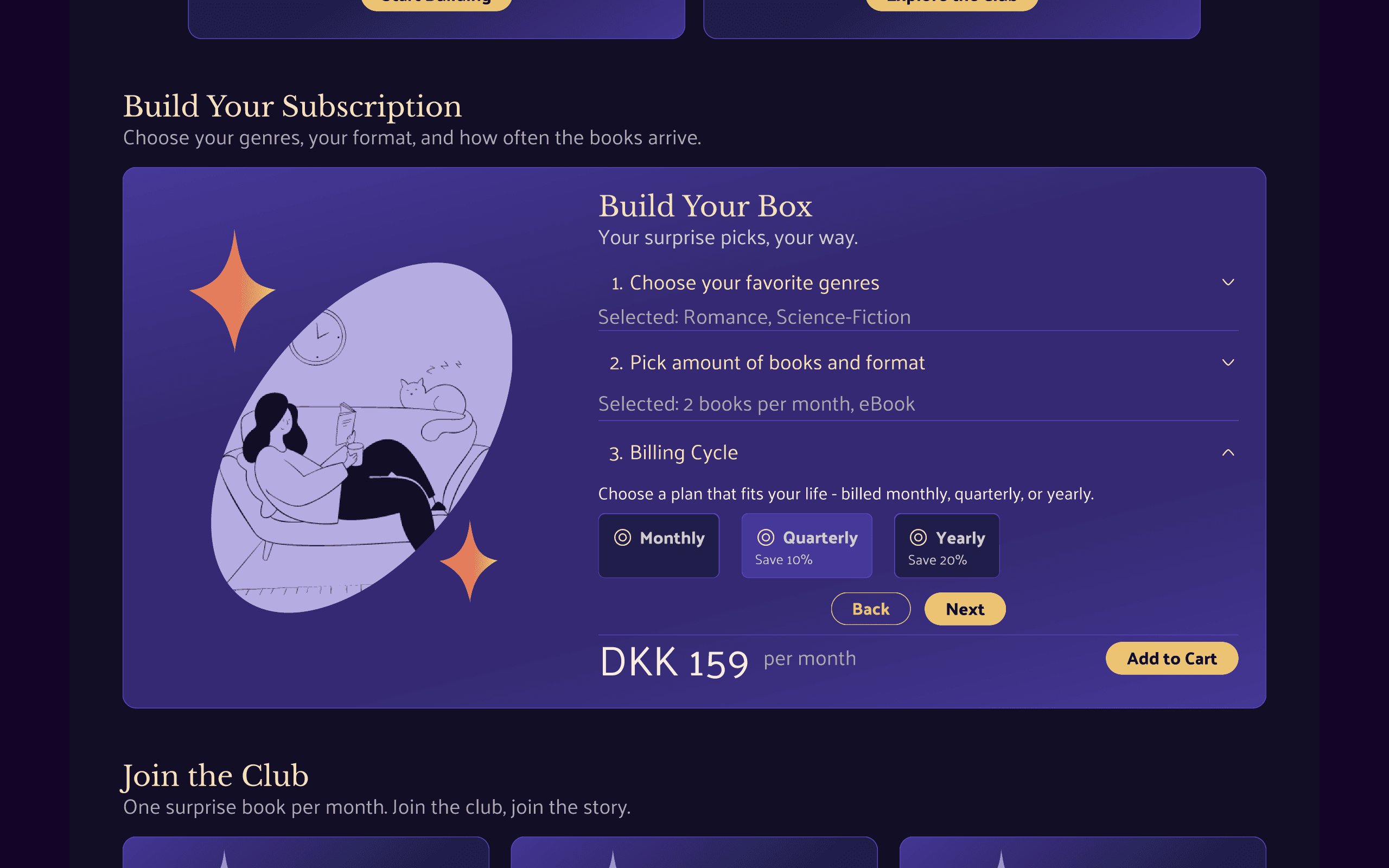
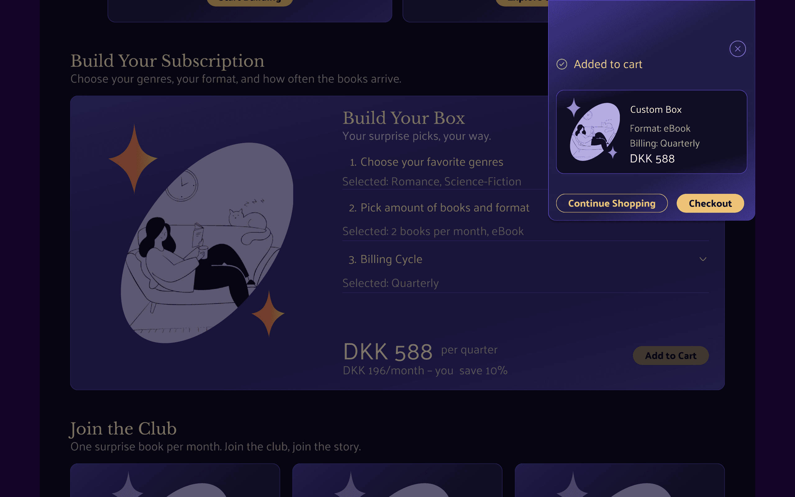
Subscription configuration is revealed progressively to reduce cognitive load while preserving flexibility.
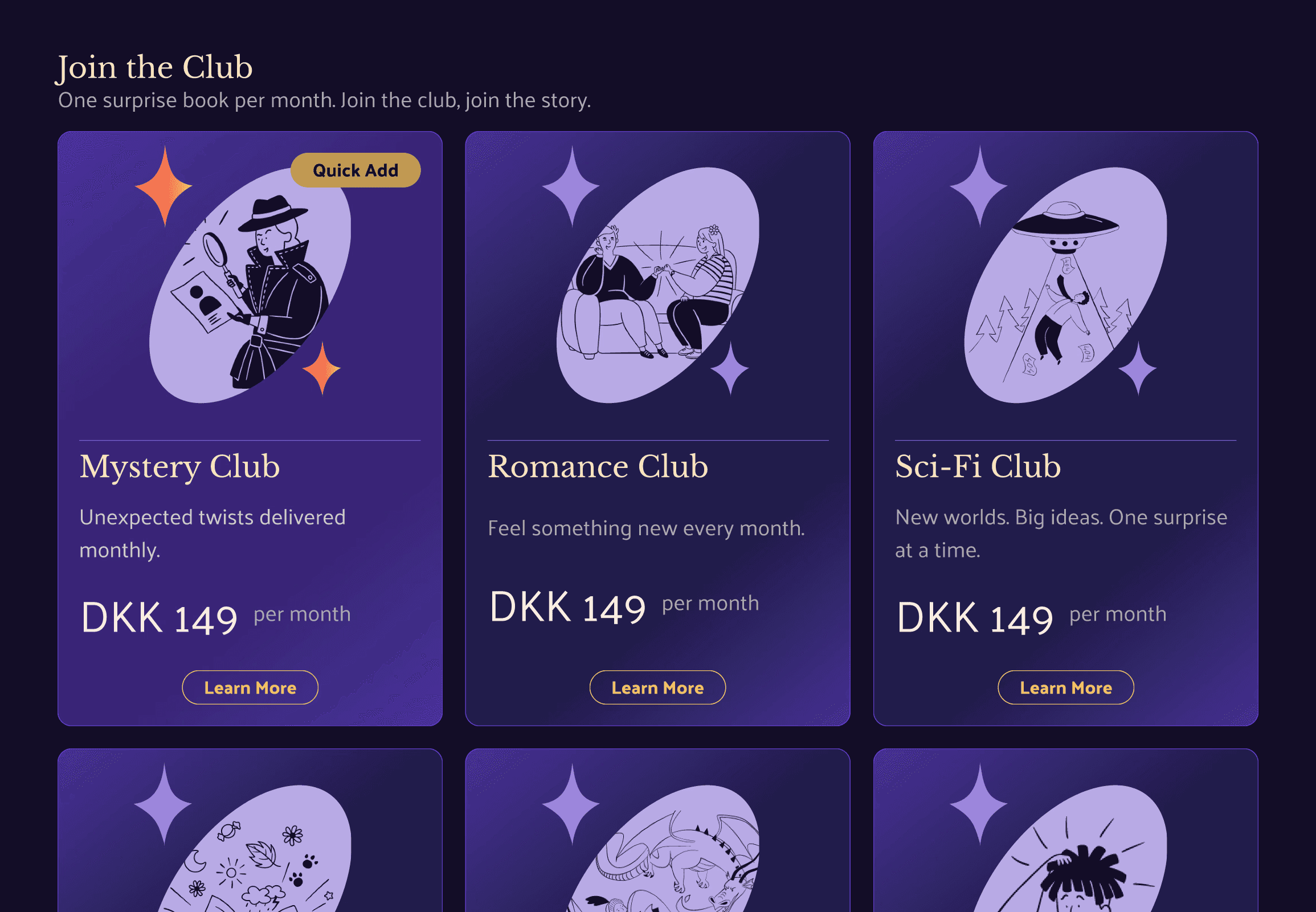
Genre Based Subscription
The idea is that in this subscription you only get one genre of books, and therefore it also comes with the option of joining a book club that is reading the same book or types of books.
A quick add option allows users to commit with minimal effort, making it clear what they receive by default while keeping deeper customization available but optional.
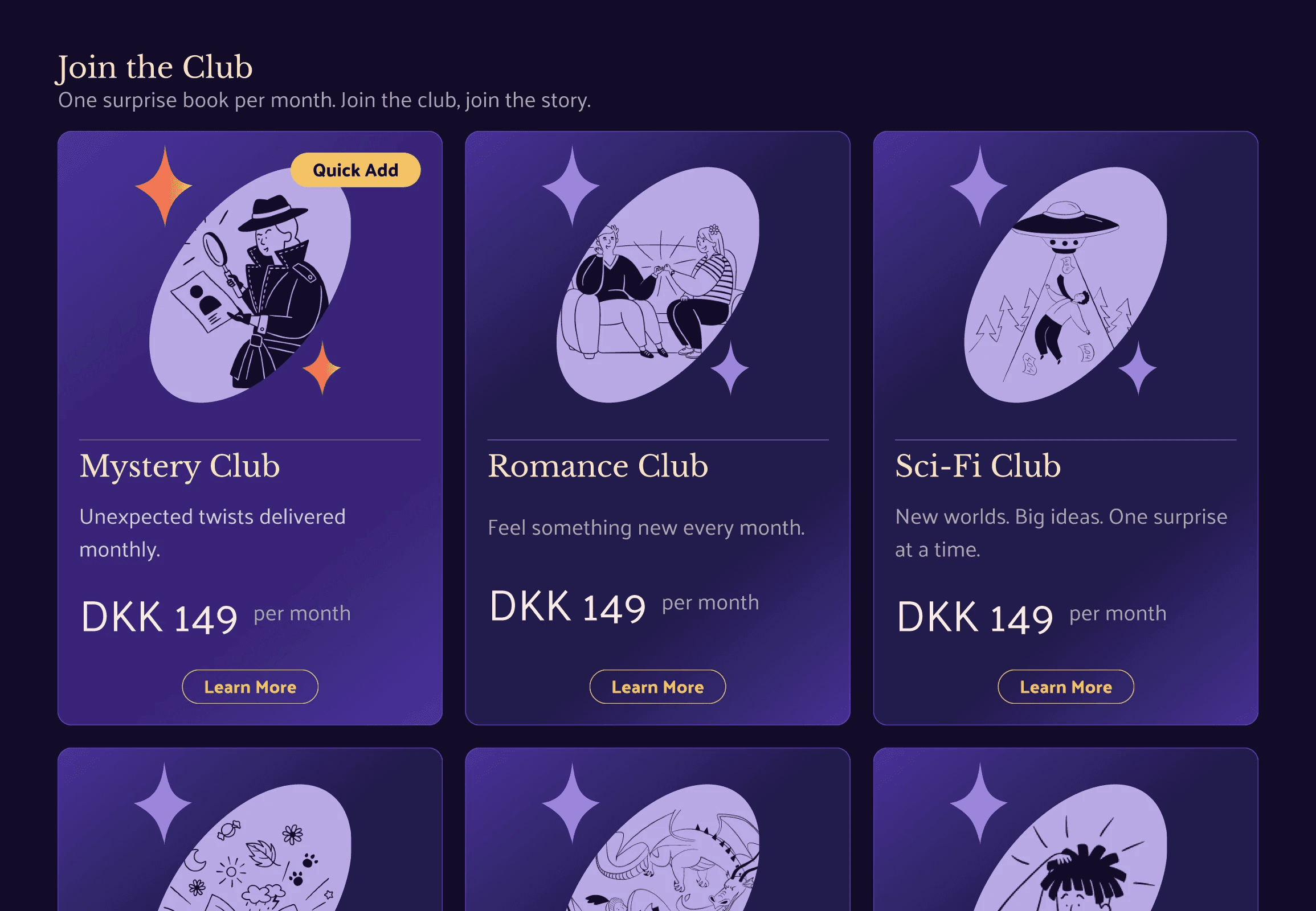
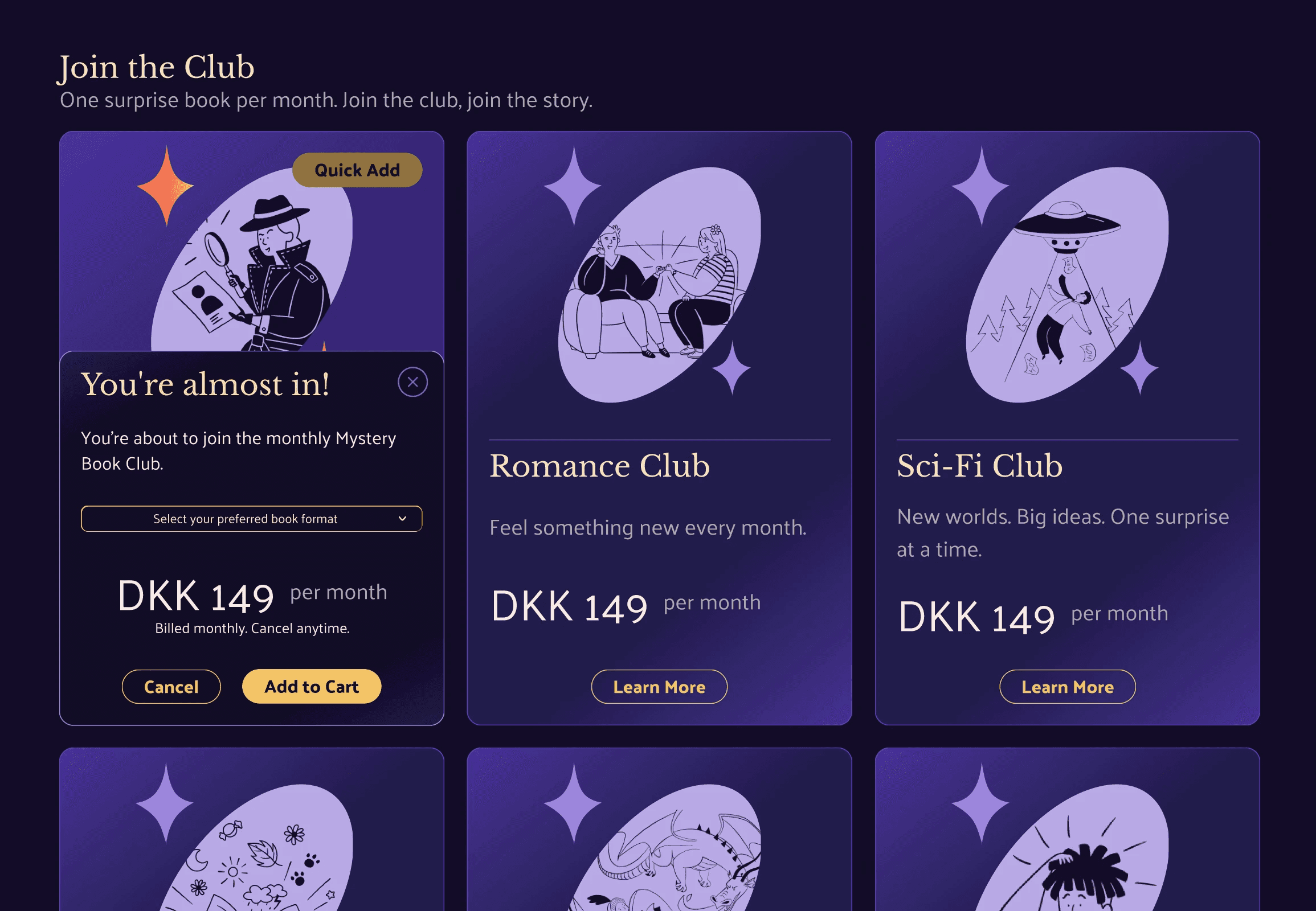
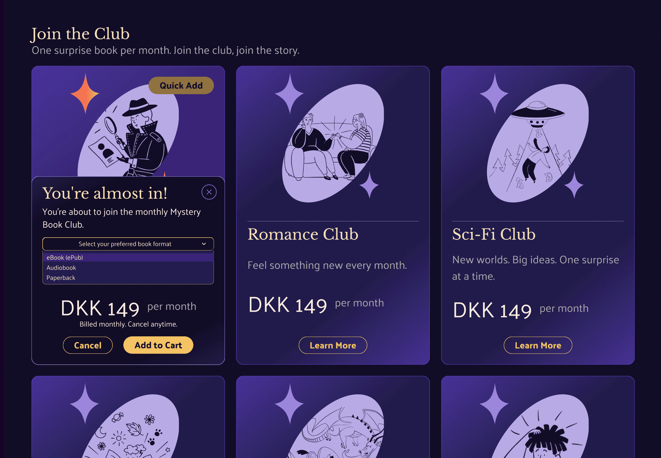
A quick add option sets clear expectations with minimal effort, while keeping deeper customization optional.
Visual Identity & UI System
The visual identity for Wonder Books was designed to create a cozy, immersive reading experience while maintaining clarity across complex subscription decisions.
Color System
Readability
Text / Secondary
Text / Primary
Action & Commitment
Yellow/500 → Primary Action
Yellow/300 → Action Emphasis
Yellow/200 → Action Accent
Structure & Brand
Purple/900 → Primary Brand Background
Purple/800 → Content Surface
Purple/500 → Secondary Action / Strong Accent
Card Gradient → Featured Surface
Decoration & Depth
Purple/500 → Secondary Action / Strong Accent
Purple/400 → Accent Emphasis
Purple/300 → Decorative Fill
Purple/200 → Soft Decoration
Purple/100 → Lightest Decorative Tone
Typography hierarchy
H2
H3
UI/Large
Body
Caption
UI components using the system
1
Genre
Genre
Genre
Monthly
Billed Monthly
Select your preferred book format
Select your preferred book format
eBook (epub)
Audiobook
Paperback
Accessibility considerations
Contrast & readability: Designed dark-mode first to ensure clear contrast, legibility, and hierarchy across text, actions, and states.
Clear labeling: UI copy and labels were written consistently to support screen reader interpretation and reduce ambiguity in complex flows.
Keyboard-aware interactions: Progressive disclosure patterns were informed by research into accessible accordion behavior and non-visual navigation.
Safe overlays: All overlays and expanded states include clear exit paths to prevent users from becoming trapped.
Implementation-minded: While not developed or tested with assistive technologies, the design uses clear structure and naming to support accessible development.
Key Insights and Decisions
Flexibility and ease of use are closely linked; more control increases complexity
Decision hierarchy is critical in subscription design
Progressive disclosure helps preserve flexibility without overwhelming users
Visual systems play a key role in guiding attention through complex flows
Outcome
Flexibility requires intentional constraints
Allowing users to customize their experience without structure quickly increases cognitive load. This project reinforced the need to actively shape how and when flexibility is introduced.
Decision hierarchy should include a clear baseline
Providing a low-effort entry point; such as a quick add action can help set expectations and reduce decision anxiety, while keeping deeper customization available but optional.
Visual and interaction systems shape perceived complexity
Clear hierarchy, spacing, and progressive disclosure significantly influenced how approachable the experience felt, reinforcing how design systems directly support cognitive load in decision-heavy products.