
Wonder Books
Designing a Customizable Book Subscription for Modern Readers
Overview
Wonder Books is a desktop web concept delivering monthly surprise books (physical or digital) to readers who crave mystery and customization. Though this was a UI design course project, I approached it holistically, blending UX research, accessibility, and branding into a minimal, inclusive, community-driven experience tailored to modern readers.
Key Role: UX/UI Designer — End-to-end product design, branding, prototyping
Project Type:
UI Design course project
Tools Used: Figma (UI, prototyping), Affinity Designer (logo & brand assets)
Key Skills
UX Design | UI Design | Prototyping | Branding | Accessibility | Figma | Affinity Designer
Identifying the Gap
Most mystery book subscriptions focus on curated boxes with book related items, which often feel wasteful and don’t always match the subscriber’s tastes. Plus, they mostly serve physical book lovers, ignoring digital and accessible formats.
The Opportunity
I wanted to design a subscription that delivers only what matters: a great book in the format users want—whether that’s audiobook, ebook, or paperback.
This approach serves:
Eco-conscious readers seeking less packaging and waste
Digital-first users needing accessible formats
Anyone who values surprise, personalization, and community

2. Competitive & UX Research
I studied direct competitors to see what is the current state of products similar to the one I was developing. I also looked at indirect competitors to see if I could borrow useful practices and finally unrelated competitors with good UX and UI.
Direct Competitors
all great for physical boxes but lacking digital or sustainability focus

Indirect Competitors
For community, use of different book formats and reader insights.

UX/UI References
Referred for shopping flows, dark mode designs, and accessibility.

3. Defining the Challenge
Problem Statement
How might we create a minimal, customizable book subscription that prioritizes great stories, flexible formats, and welcomes a diverse, inclusive readership?
Project Goals
1. Customization Without Complexity
People should be able to choose what fits their reading style. That includes genre, number of books, format (print or digital), and billing preferences.

2. Accessibility from the Start
The design supports screen readers, keyboard-only navigation, and dark mode. We built these features in early so the experience works for more people.

3. Simple and Sustainable
We kept the packaging minimal and focused on what matters most: the book.

4. Personal with Room for Connection
Each subscription is tailored to the reader. For those who want to connect, we added an optional online book club.

4. Personas
Instead of starting with typical user interviews, I looked at who was missing from existing book subscription services. Through competitive research, I identified audiences that current offerings often overlook.

Eco-Conscious Reader
Sonia
“I want to read without creating waste.”
Needs a minimal, digital-friendly service that respects sustainability.

Visually Impaired Reader
Maurice
“I love reading but need accessible formats.”
Needs audiobooks, large print, and an inclusive UI.
5. User Flow & Site Architecture
I mapped a clear journey focusing on discovery and retention with three main areas:
Home Page
Introduces Wonder Books and how it works. Encourages exploration my providing past picks in subscriptions and testimonials.
Subscription Page
Get a book experience by subscribing to a custom subscription and/or joining a genre based book club.
Profile Page
Manage subscriptions, rate books, personalize

Key flow:
Homepage → Subscription → Cart → Checkout → Payment (checkout not prototyped)
Returning users: Login → Profile → Manage Preferences
Colors
Wonder Books uses a cozy, story-driven palette to evoke warmth and focus:
Deep Purple as the primary background and card color, often with a soft gradient.
Warm Yellow offers high contrast in both color and value, creating a gentle “glow” effect for key elements like buttons and highlights.
Soft Orange is used sparingly for hover states
Together, these colors balance accessibility, visual interest, and a clear sense of atmosphere.
5. Branding & Visual Identity
Inspired by cozy reading moments bathed in warm light and twilight hues, blending comfort with modern minimalism.

Typography
Libre Baskerville (headings), Palanquin (body, smaller headings) for a classic yet clean look and readability.

Logo
The logo’s circular form represents a portal or black hole, symbolizing how each book draws readers into a new world. This shape is used throughout the site to echo the brand’s theme of discovery and immersion.
Logo iterations:

6. Sketching, Wireframing & High Fidelity
Started with rough sketches to explore layouts and content. Moved to wireframes, gathered feedback, iterated, then polished with high-fidelity designs incorporating accessibility best practices.

Home Page Sketch

Subscription Page Sketch

Profile Page Sketch

Home Page Wireframe

Subscription Wireframe

Profile Page Wireframe

Home Page High-Fidelity

Subscription Page High-Fidelity

Profile Page High-Fidelity
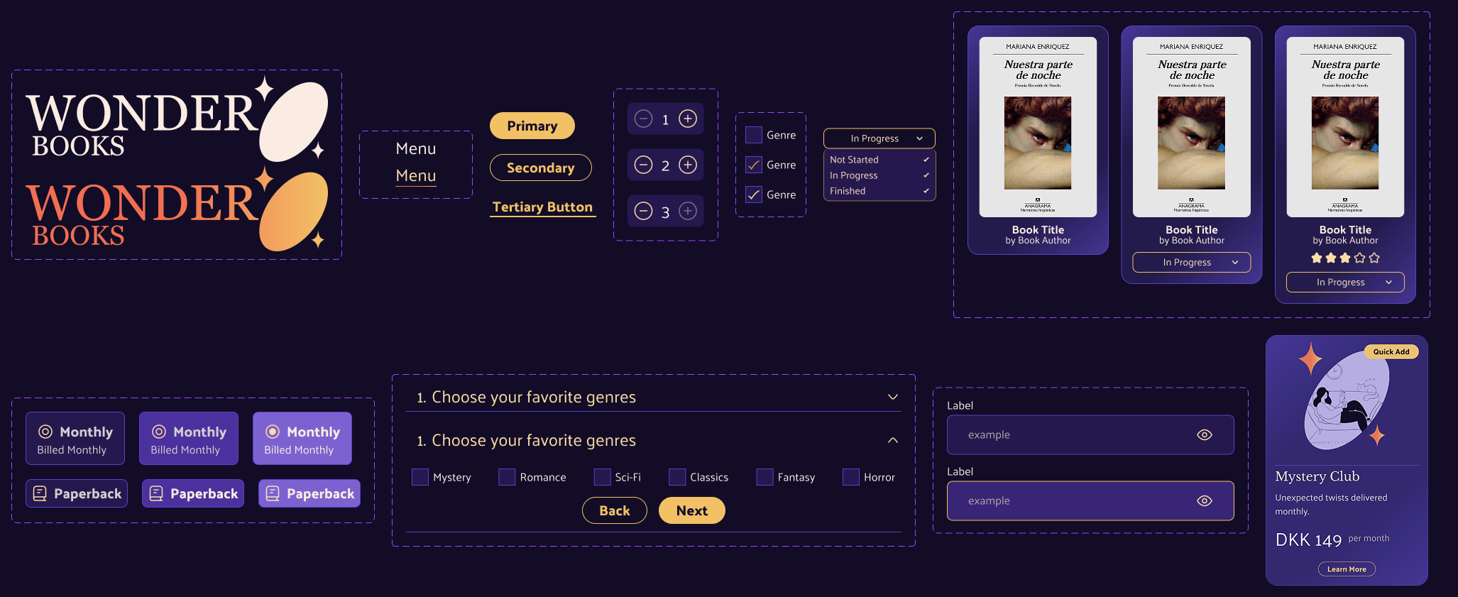
7. Design System
Developed core UI components: buttons, dropdowns, inputs, cards. Focused on consistent styling, hover and focus states, ensuring accessibility and brand harmony.
8. Final Design

Home Page
Introduces Wonder Books, showcases past picks, and features testimonials to spark curiosity and build trust.
Prototype Demo
Subscription Page
Lets users customize their book box by choosing genres, formats, and billing preferences in a clean, guided flow.

Purchase Flow

Profile Page
Allows users to rate books, manage subscriptions, and update preferences with ease.
Sign-in and profile Flow
Prototype Demo - You will see home page, subscription selection and cart
Prototype Demo - Log In, Profile and Book Ratings
9. Final Thoughts
This project taught me to balance ambition with focus; prioritizing key features over quantity. Accessibility and minimalism guided me to simplify customization while maintaining flexibility and inclusivity.
If I had more time, I’d explore sustainability features like local book pick-ups or a book return/reuse system with user rewards. Usability testing, especially for keyboard navigation and accessibility, would also deepen the design’s impact.
Attributions
All illustrations used in Wonder Books and this page were from Free illustrations from Streamline.